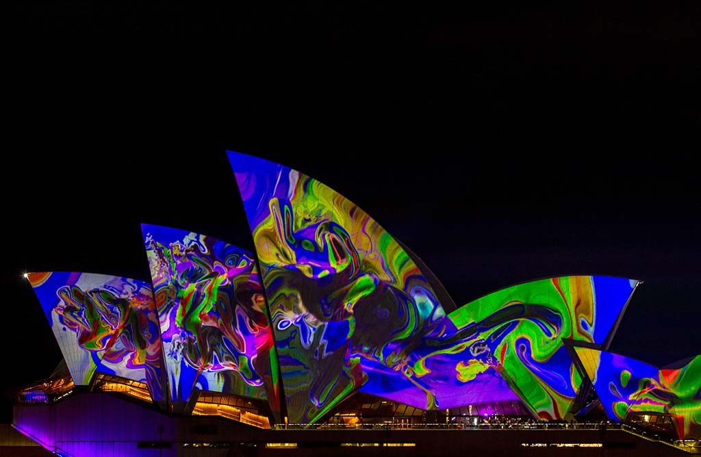
Before you start a professional design or printing project, it is never pointless to check the basics of color. Of course there are a lot of different approaches, but everyone starts by knowing a little about color theory, because, let’s face it, some colors work well together, and some colors work in opposite directions. Choosing too vibrant a color palette can erase the message you want to share, and too soft colors can pass the message on to people.
Selecting a Color Scheme: The Color Wheel
The chromatic wheel, created in 1666 by Sir Isaac Newton, is still used today as the basis of basic color theory and is an excellent tool for selecting a color model. The color wheel consists of 12 colors based on the primary colors red, yellow and blue and is designed to mix or complement almost all the colors you choose. The wheel can then be divided in different ways to create basic color palettes. For instance:
Primary, secondary and tertiary colors: Primary colors are those on which the color wheel is based: red, yellow and blue. The secondary colors are green, orange and purple, which lie between the basic colors of the color circle. The other colors are called tertiary colors, which are created by mixing primary and secondary colors.
Warm/cold colors: The color wheel can also be divided into warmer and colder colors by halving it. The warm colors lie between bright purple and green, the cooler colors on the opposite side.
Shading: You can develop all basic colors with white, black and gray to create a wide variety of different shades and shades. Experimenting with it can be a good way to develop color ideas for any project. Maybe you only need one or two colors to bring your idea to life, and fill the rest with different shading techniques.
Techniques for creating color models
Once you have refreshed your knowledge of the basics of color theory, a look at some simple color schemes is a good way to let the creative juice flow. There are a lot of different variations, but here are some color schemes that can be used as templates for selecting a color scheme:
It’s free: These are colors that lie opposite each other on the color circle, such as blue and yellow or red and green. Complementary colors can be used to create bright and vibrant patterns, but it is important not to use them together so that your pattern is not too hard on the eyes. Also, avoid using these types of colors for the text.
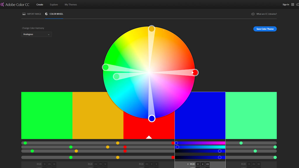
Analog: These are color schemes that are created by using colors side by side on the color wheel. For example, orange, red and purple go very well together. This type of color scheme can be very soothing and is often found in nature.
Complementary split: As the name suggests, it is a clever shot on the complementary color palette. Basically, you can change this instead of using two opposite colors on the color wheel by using the two colors next to one of the complementary colors. For example, instead of using green and red, try green, red violet, and red-orange.
Define a mood
The use of a simple color scheme can be an excellent way to create an atmosphere. Whether you want to create something that really stands out, or a design that conveys a more relaxed message, you can use colors to your advantage. Think about your favorite colors and how they affect your mood. Here are some examples:
Red: This color can stimulate positive energy, courage, strength, masculinity and masculinity, or it can represent more negative qualities such as confusion and aggression. Red is a very strong color that is clearly visible from a distance. It also attracts our attention and can inspire us. There is a reason why so many people buy red sports cars.
Blue: Extremely versatile, blue can be used to represent a variety of different moods, including intelligence, freshness, logic, cold and calm. Essentially, blue is a soothing color for the mind, and it is a very light color that makes it a good color to communicate a message.
Green: One of the most relaxing colors, green stands for health, vitality, balance and peace; it is one of the most common colors in nature, so why not? Because green is at the center of the color spectrum, it is a very balanced and light color for the eyes.
Orange: A combination of yellow and red, orange can be an extremely versatile color. It can bring us a whole range of moods and emotions, including comfort, warmth and passion. The orange can also remind us of the seasons (autumn), food (pumpkin pie) and holidays (Halloween).

Tools & Tools
If you’re still having trouble choosing the right color combination, try one of the many computer programs or templates available on the Internet. These programs are designed to make selecting a color scheme very easy and very intuitive. Programs such as Adobe Color CC and ColorExplorer are designed to make it easier for you and at the same time further develop your design preferences. In addition, while you continue to design and print things for your customers, you can use a program to create excellent templates and color schemes to keep them handy.
Most printers use the CMYK process (cyan, magenta, yellow, black), which allows them to produce an almost unlimited number of colors with shades using only these four basic colors. To ensure that the colors you select for your print project appear correctly on the page, it is a good idea to use a Pantone color bridge guide.